I know I’ve been promising you girls more #HBDesertCasa content for a while now so I’m excited to share more details behind our kitchen reno! If you girls have been around throughout this process, you might have remembered me saying we weren’t going to do much to the kitchen…just a little facelift…and well, we ended up going ALL IN. This was definitely not the plan but here we are. I’ll share all the details below but let me know if you have any questions- and don’t forget I have a bunch of other #HBDesertCasa content HERE.
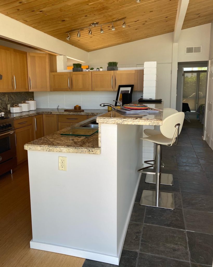
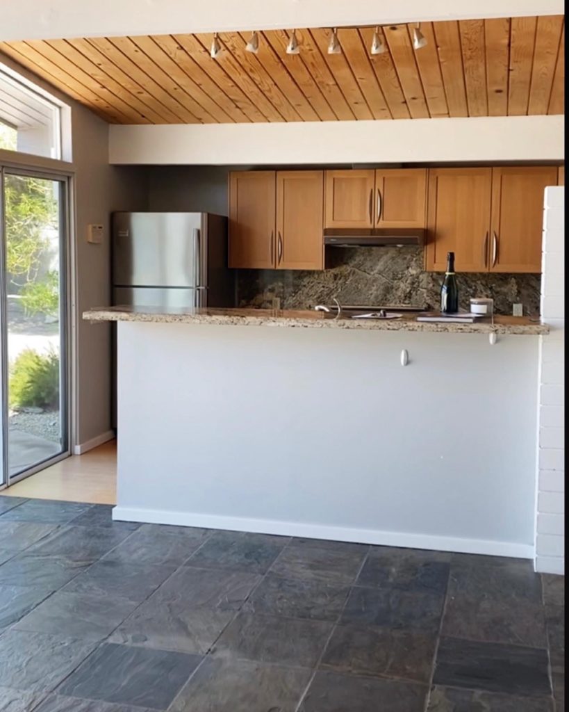
We fell in love with the Mid Century Modern architecture of this house right away but most houses built in this era had very closed-off kitchens and this house, in particular, had a weird walkway behind the kitchen. The flow bugged me from the start but to keep costs down, originally I planned on doing a rad bar within the hallway as a focal point. After more thought, we ended up deciding to knock down the wall to the hallway/to the side of the kitchen and it made the BIGGEST difference right away! Even the hubs agreed that the extra demo was a good call.
From there, we wanted to leave the original floors in the kitchen since they added to the retro vibes (even though they felt pretty busy to me with the detailed wood ceilings…) but when they redid some piping, they ended up having an issue and had to rip up some of the floor. It was impossible to find the exact floor to match since it’s from decades ago so we ended up ripping up all the old tile. It was definitely more than we intended to spend but in hindsight, I’m not exactly upset about it lol!
Once I knew we were redoing the floors, I wanted to keep things super minimal since the other features were very Mid Century and busier.
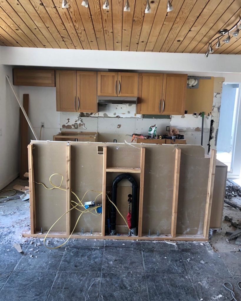
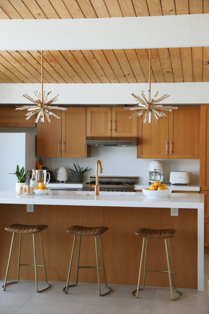
Things got a little complicated at this point design wise though since I had already ordered the backsplash tile and countertops- which I kept simple to match the original floor (before we ended up going with a minimal floor, too). I did want the kitchen to have some retro/unique flare so at this point, I ended up going with a cool angled kitchen island that felt true to the original decade of the house. It added a unique touch that we ended up loving! From there, I added in these fun retro pendants and these bar stools.
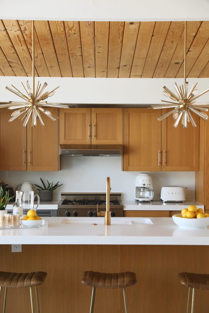
In terms of appliances, we kept most of what was in the house when we bought it- especially after spending more on the floors, and everything looks fine. We did order a new white fridge to keep the focal point fresh and bright and after an 8-month delay, she’s finally in. I swapped out the cabinet handles for these pretty acrylic ones which always delivers a big difference for pretty cheap. I splurged on some Smeg counter appliances to go with the vibe which make for a fun touch.
Overall, the kitchen feels exactly how I wanted it and how the whole house feels- retro but current and clean. We are super happy with the finished project and even though it was more $$$ and energy than we originally planned…isn’t that all renovations??

Hello! I love how you renovated your desert
Casa, would you mind sharing what flooring you went with? Its stunning!